riverfront condo install

We just wrapped up the Riverfront Condo project! This project was the perfect way to start off our year, because it served as a great practice for one of the most important design principles — scale.
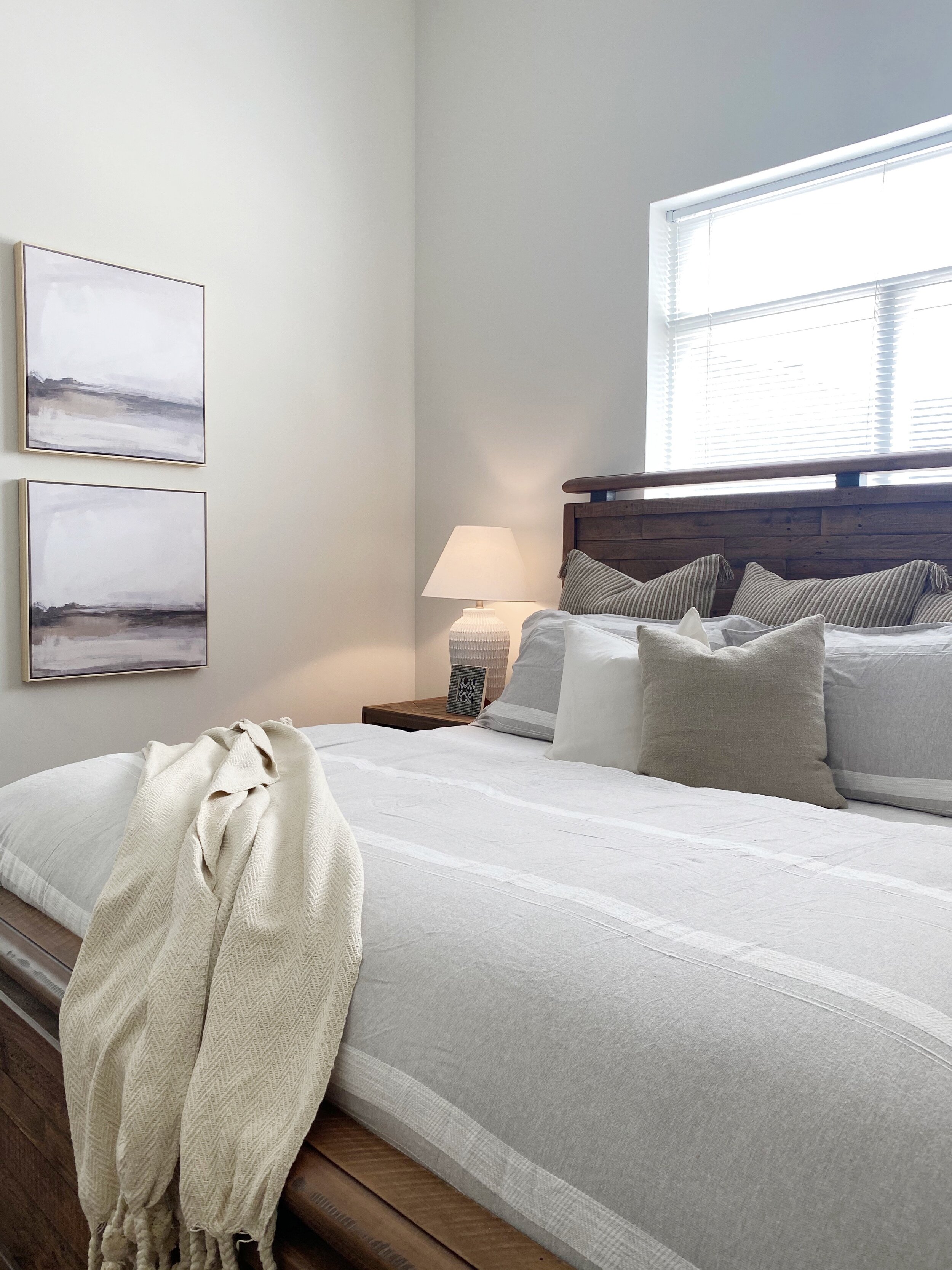
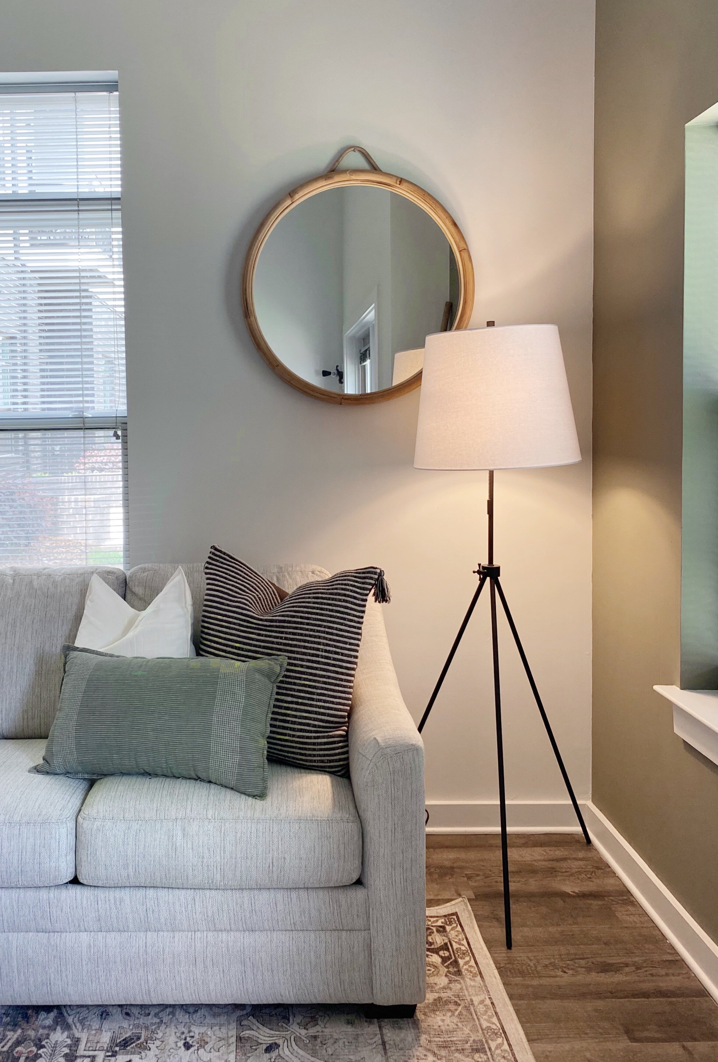
Whether it’s cramming too many large pieces into a small space, or filling a large space with too many small things -- not taking scale into consideration can easily thwart your design plan. This project brought a unique set of challenges surrounding scale. The total square footage of this condo is right around 1,000 square feet, and every room in the condo has 14 foot high ceilings. While typically a condo might require smaller scale pieces, we knew we had to incorporate some large pieces into this home to prevent these large walls from feeling too menacing.
We focused in on 3 major changes that would work together to solve this imbalanced scale problem we were facing.
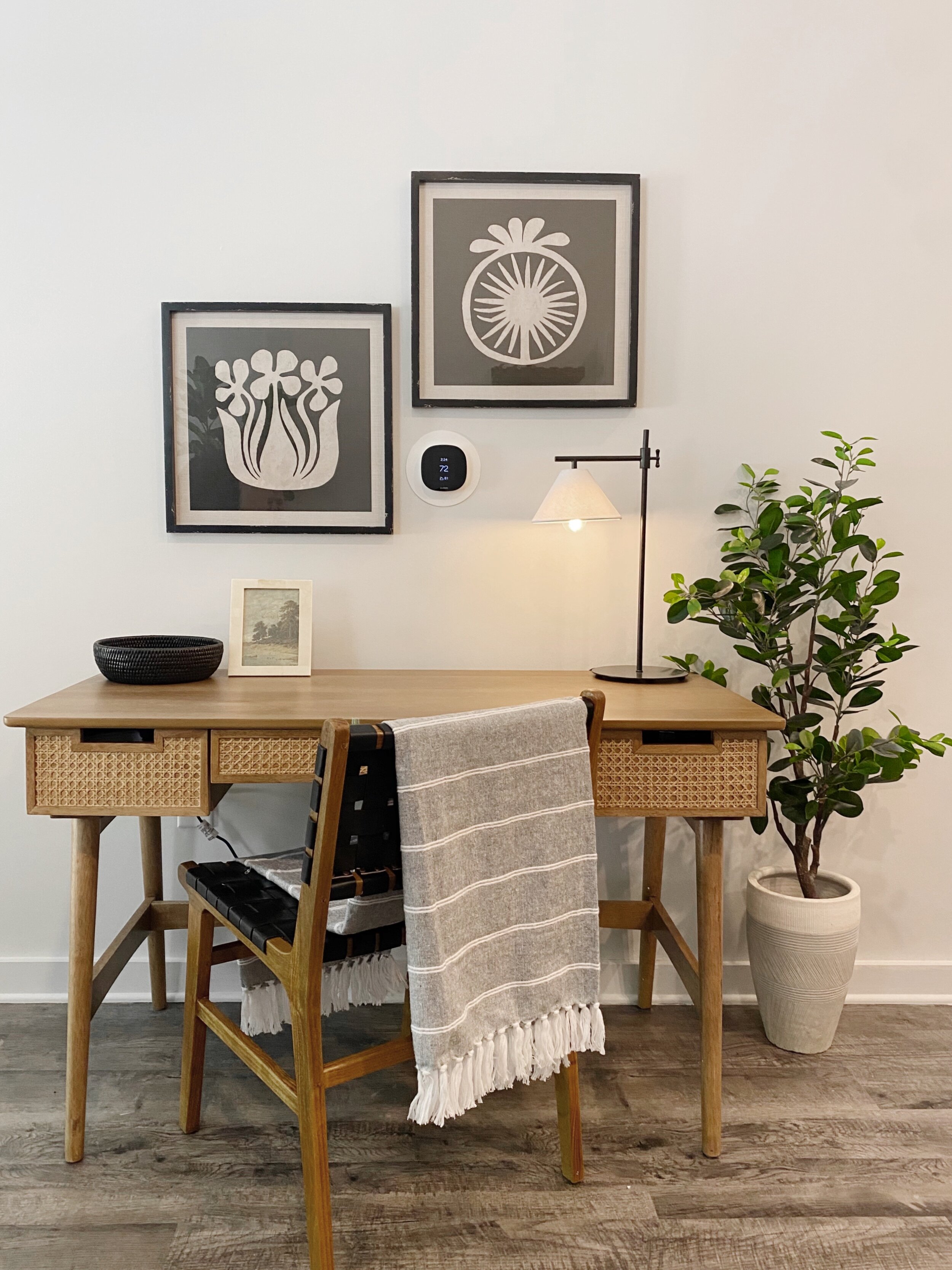
paint — At the start of this project, the trim and the interior doors were painted a medium gray color. Contrasting trim can be great in some spaces, but in this condo it brought the eye upwards which we were trying to avoid. We decided to match the trim to the wall color as one sheen shinier. (Sheen shinier reads funny, but you know what I’m trying to say!) Eliminating the gray trim brightened up the space overall, bringing the eye back down to eye level again & allowing the furniture to tell the story.
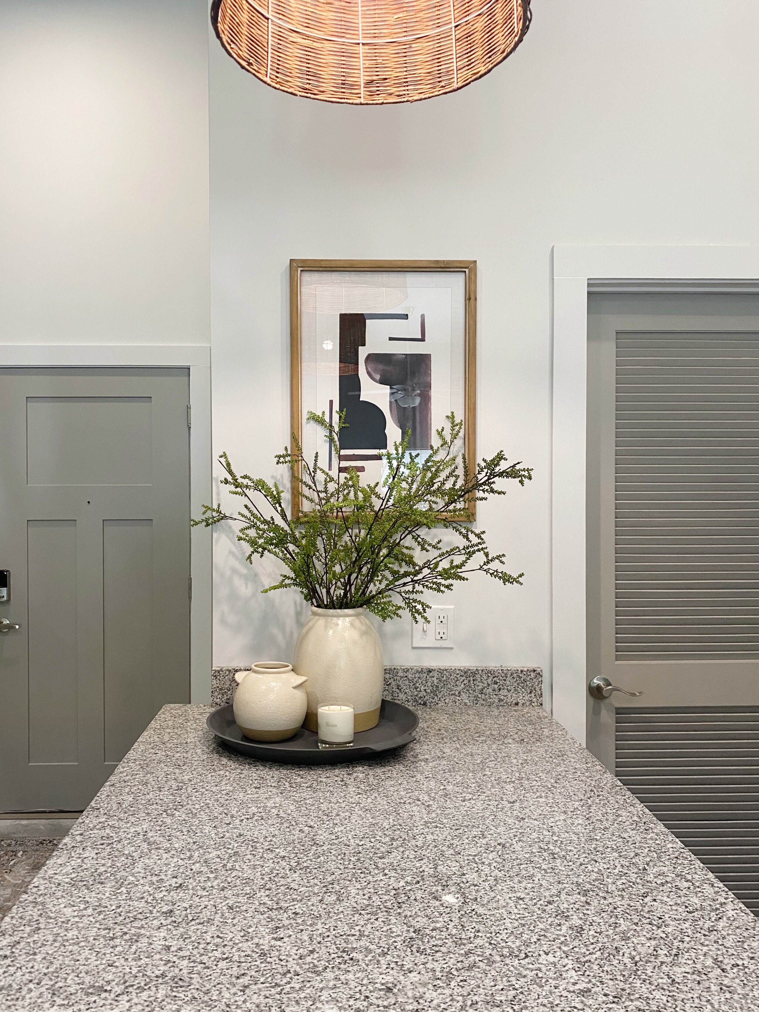
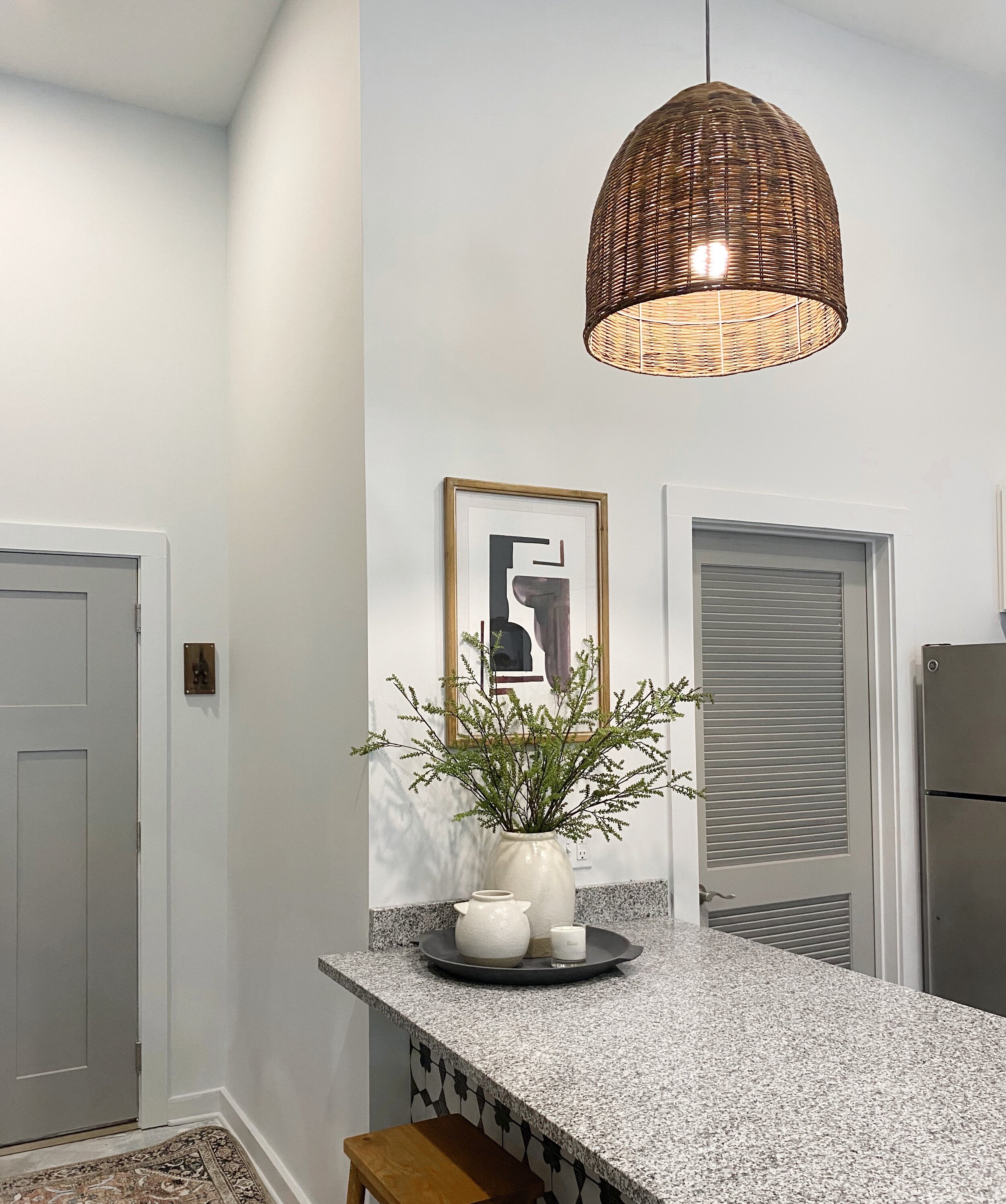
updated lighting — We removed the condo’s track lighting and installed can lights. This made SUCH a difference. The track lighting was not doing these tall ceilings justice, and we knew we needed something that could provide more light and simplify the space. Can lighting provided more uniform, clean, and a more powerful light to brighten up this condo. With so much space above the kitchen island for pendants, we knew we had to do something bold. These 20” x 20” rattan pendants were the perfect size and texture to warm up this entryway kitchen -- AND they are a great example of when putting a large piece in a room actually makes the room read larger than it is.
art placement — Sometimes your natural instinct when you see a lot of wall space (over 14 feet of vertical wall for example) is to heighten your art game — literally. We have found that (for the most part) keeping art within the boundary of window casings and door frames is a better measurement for where/where not to hang art than ceiling heights. Hanging art too high can actually draw the eye too far upwards, which draws away from your design rather than enhancing it.
Of course, furnishing the condo & creating a design plan to incorporate some of our client’s existing furniture was a crucial part of this project as well. But we found that spending a little extra time on these 3 areas helped provide scale without overwhelming the space — which really put the finishing touch on making this downtown condo a cozy getaway for our clients.
Cassie